By now it is well understood that colour is not purely decorative. Its capabilities extend far beyond aesthetics, which is already well-known within the marketing industry and those clued-up on human psychology. Our brains tend to process visual cues quicker than textual ones, and colours can add layers of meaning which can be manipulated to evoke a certain response. In today’s digital age, where an abundance of textual information can quickly overwhelm, how can colour be used to ‘visualise complexity’? How can we simplify complicated messages by appealing to a different part of our brains?
In many instances, these questions have long since been answered. TfL has each tube line colour coded to help travellers decipher convoluted maps. In the medical field, colour scales are used to interpret data so that areas of concern can be more easily discovered. It is important to note, however, the balance that comes with effective colour use. Too much colour can be even more overwhelming than too much text, while strategic use can enhance clarity.
C-me is a company that uses colour as a major part of behavioural profiles designed to provide managers and employees with insights about their strengths and weaknesses. Noticing the various pitfalls of regular personality tests, those at the company decided that colour was a more efficient way of illustrating the complexity of human behaviour.
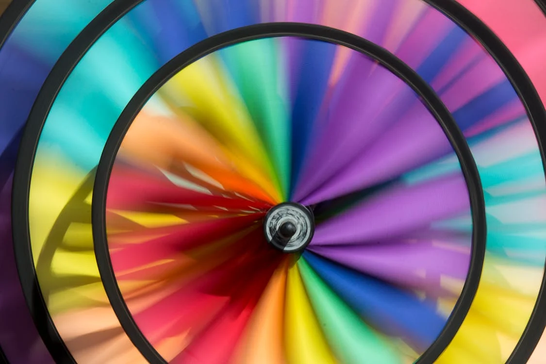
Once individuals have completed the test, they receive a blended colour wheel that represents their results. Colour, used in this way, is a means of discarding binary classifications and rigid personality categories and allows for a more nuanced interpretation of information. After all, people are complex, and the issue many businesses had with traditional personality tests was their tendency to over-simplify.
The association of colours with certain behaviors or emotions is often subconscious and therefore unavoidable, so it would make sense not to fight against this. C-me associates calmer behaviours such as thinking and reflection with blues, while extraversion is associated with reds and oranges. In many ways this appeal to the subconscious is way more memorable than black and white text on a page.
It is true, in many cases, that by recognising and leaning into the complexity of a certain situation, we are better positioned to decipher it. By recognising the complex nature of human employees and applying strategies that play into this, C-me can provide answers that are more applicable to reality.
On a wider scale, C-me’s approach signifies a larger shift towards visually-driven communication. While the aesthetics of colour are engaging in the first instance, the various meanings behind them can add another layer of interpretation in the moments that follow. Businesses that deal with large amounts of complex information shouldn’t underestimate the power of colour as a tool to boost understanding, engagement and productivity.
Leave a Reply